Revamping the Digital Experience and Visualisation for PLUS Miles (Assessment)
Revamping the Digital Experience and Visualisation for PLUS Miles (Assessment)
Industry
Expressway Service Provider
Industry
Expressway Service Provider
Industry
Expressway Service Provider
Durations
3 Days
Durations
3 Days
Durations
3 Days
Role
UI/UX Designer & Consultant
Role
UI/UX Designer & Consultant
Role
UI/UX Designer & Consultant
Background
PLUS Malaysia Berhad (PMB) is the preferred expressway partner for travellers in Peninsular Malaysia, operating over 1,130km of dual multi-lane roads across seven states on the west coast, including the Federal Territory of Kuala Lumpur.
Guided by our core values, we connect communities to shape a safe and sustainable future, playing a significant role in driving green practices, continuing to be a vital part of Malaysia’s transport network, and contributing to the economic growth of the nation.
Core Problem
The current system faces challenges with an outdated UI and poor user experience, which lead to:
A visually unappealing, non-intuitive design that lacks modern aesthetics, reducing user engagement
Complex and cluttered navigation, making it difficult for users to find essential features or services
A steep learning curve, especially for new users, contributing to lower adoption and user retention
Inefficient and confusing workflows that frustrate users, impacting overall productivity and ease of use
Lack of consistent branding and design coherence across different sections, making the interface feel disjointed
Overcrowded interface with too many options in one place, leading to decision fatigue for users
Approach for PLUS Miles
To enhance usability and modernise the interface, we implemented a user-centred design strategy focused on simplifying navigation, improving aesthetics, and streamlining workflows. Our objective was to minimise the learning curve, boost user satisfaction, and ensure seamless cross-device accessibility for a more inclusive and efficient experience.
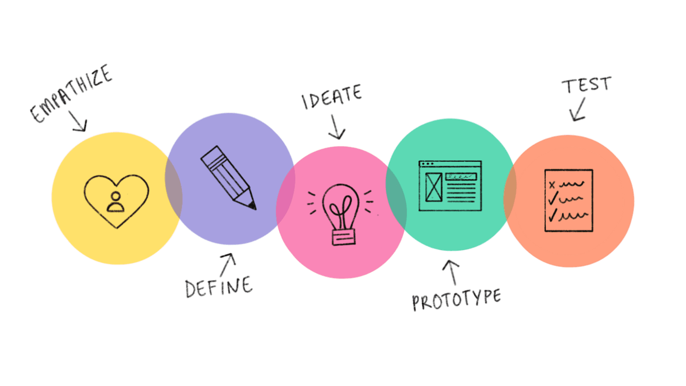
Design Process
To begin the process, I applied the Design Thinking approach to gain deeper insights into user pain points and gather comprehensive data to inform the design decisions.
Design Process
To begin the process, I applied the Design Thinking approach to gain deeper insights into user pain points and gather comprehensive data to inform the design decisions.
Design Process
To begin the process, I applied the Design Thinking approach to gain deeper insights into user pain points and gather comprehensive data to inform the design decisions.
Steps Taken
UI Redesign
Applied a modern visual design system, in line with current design trends and user expectations
Introduced a clean, consistent layout and intuitive iconography for improved usability
Navigation Overhaul
Reorganised the information architecture to enable easier and quicker access to core features
Implemented a simplified menu structure and clear pathways to guide users through key tasks
UX Optimisation
Streamlined task flows to reduce the number of interactions and minimize confusion
Designed onboarding tips and contextual help features to support new users and enhance user learning
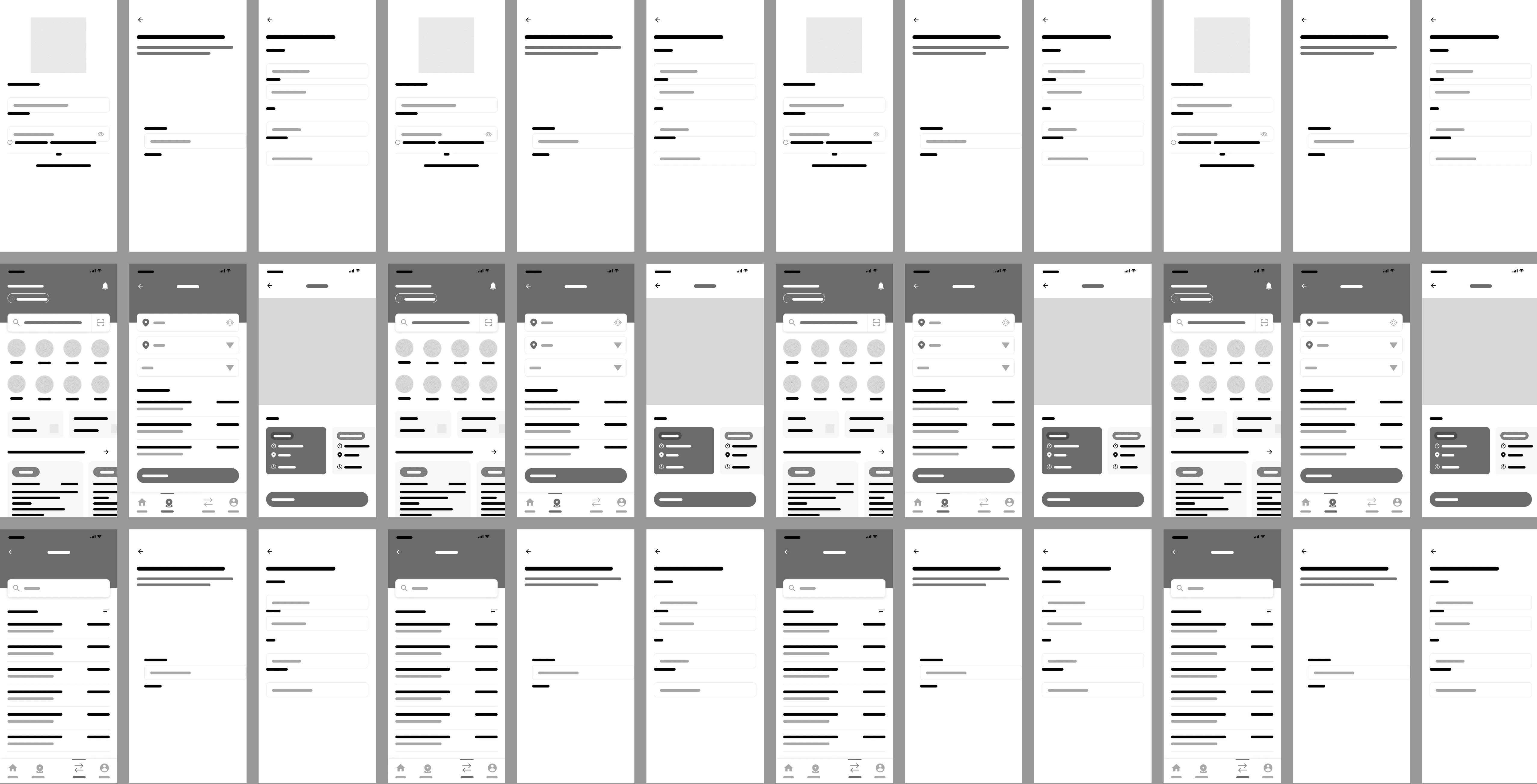
Wireframes
These low-fidelity wireframe concepts have been refined from the existing design, incorporating insights from comprehensive research. Based on key findings, I developed a wireframe that specifically addresses the identified user pain points.
Key insights from the research revealed the following challenges:
A steep learning curve, particularly for new users
Unintuitive and cluttered navigation, making the system difficult to use
Disjointed workflows that hinder task completion
Outdated design, relying on legacy UI concepts that do not meet modern standards
Redundant features that create confusion among users
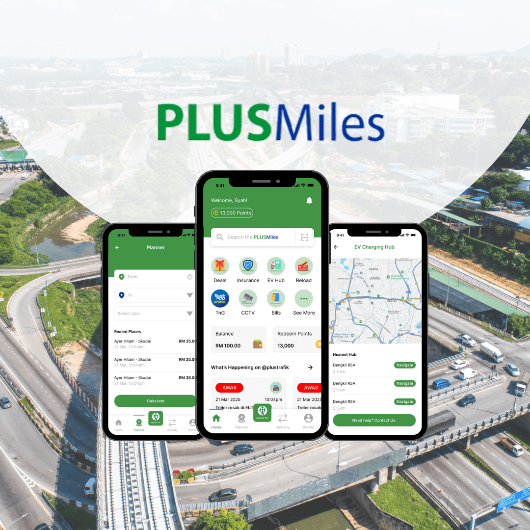
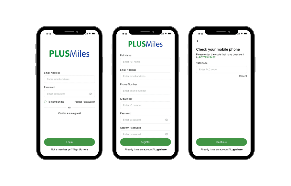
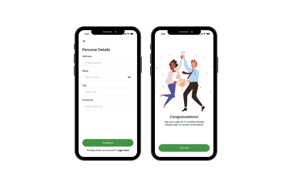
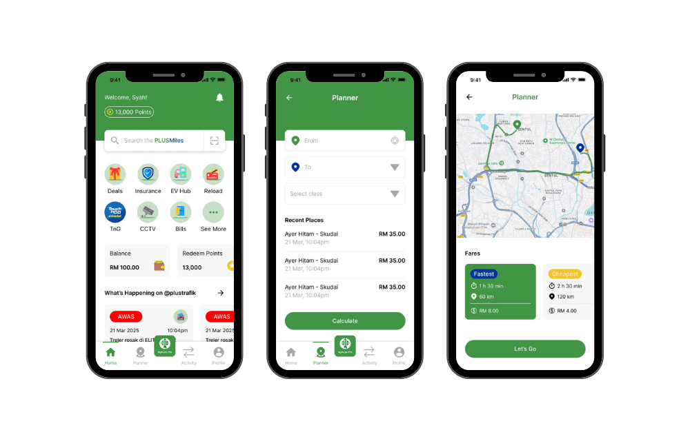
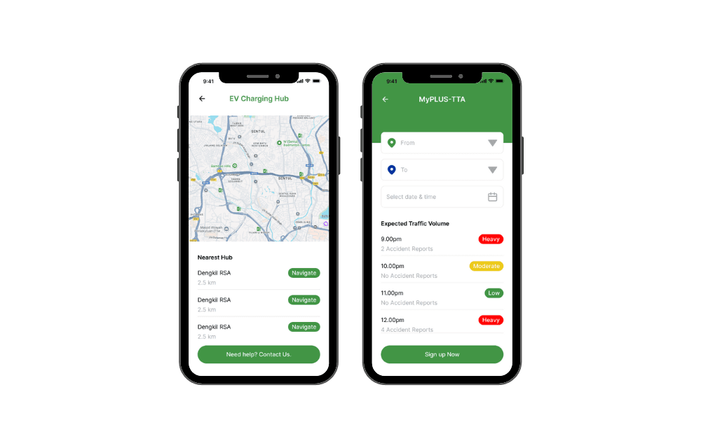
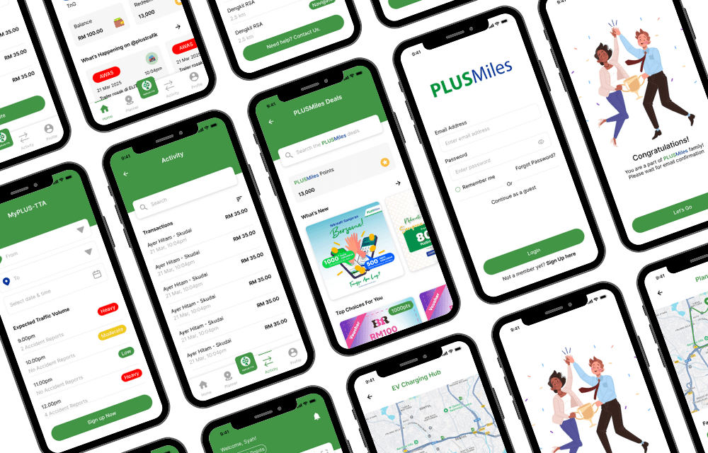
Hi-Fi Design Concept
These pages highlight the major improvements implemented based on earlier user feedback and the approved wireframes. They incorporate key enhancements in usability, navigation, and visual consistency—directly addressing the pain points identified during research.
Each page was carefully refined to ensure a more intuitive user experience, optimised layout structure, and better content hierarchy. The finalised designs are now ready for handoff to the development team for implementation.
Results and Impact
Improved User Experience: The redesign addressed key challenges such as a steep learning curve and cluttered navigation, resulting in a more intuitive, user-friendly platform.
Streamlined Workflows: Disjointed workflows were optimised, leading to smoother task completion and increased efficiency for users.
Modernized Design: The outdated UI was updated to align with modern design standards, enhancing the visual appeal and usability of the platform.
Reduced Redundancy: Redundant features were removed, reducing confusion and simplifying the user experience.
Key Improvements
Simplified Navigation: The information architecture was reorganised to make essential features more accessible, reducing complexity and improving user flow.
Modernised Visual Design: The UI was updated to reflect current design trends, offering a more visually appealing and cohesive user interface.
Streamlined Workflows: Task flows were optimised to reduce the number of steps required to complete key actions, enhancing user efficiency.
Feature Consolidation: Redundant features were removed or merged, clarifying the user experience and reducing confusion.
Enhanced Onboarding: New users were provided with clear, intuitive onboarding guidance to minimize the learning curve and improve early adoption.
Key Outcomes
Enhanced User Engagement: The more intuitive design and simplified navigation led to higher user adoption and prolonged interaction with the platform.
Increased Efficiency: Optimised task flows and mobile compatibility led to faster, more efficient task completion, improving productivity for users.
Higher Retention Rates: The reduction of redundant features and clearer onboarding experience contributed to a higher rate of user retention.
Improved Accessibility: The redesign ensured better cross-platform compatibility, making the platform more accessible to users on various devices, including mobile and tablets.
Faster Onboarding: New users were able to onboard more quickly thanks to the clear and intuitive design, resulting in faster adoption and less training time.
Reduced User Confusion: By eliminating redundant features and simplifying navigation, the platform saw a reduction in user confusion, enhancing overall task completion rates.
Increased Feature Utilisation: The streamlined design and clearer feature organisation led to increased usage of key platform features by users.